I repeatedly write about the importance of economic growth, usually citing data about gross domestic product (GDP), which is defined as “a monetary measure of the market value of all the final goods and services produced in a specific time period.”
And I frequently use that GDP data when comparing long-run performance for various nations in order to demonstrates that you get more economic output with free markets and limited government.
Critics sometimes respond by arguing that GDP is an abstract measure that doesn’t necessarily capture the actual well-being of people.
I’ve addressed this concern in the past by pointing out that you find the same relationship between prosperity and economic liberty when looking at the OECD’s data on “actual individual consumption.”
But Max Roser of Oxford University recently shared some data (from Our World in Data) that may be even more useful because it shows that GDP is strongly correlated with median daily expenditure.
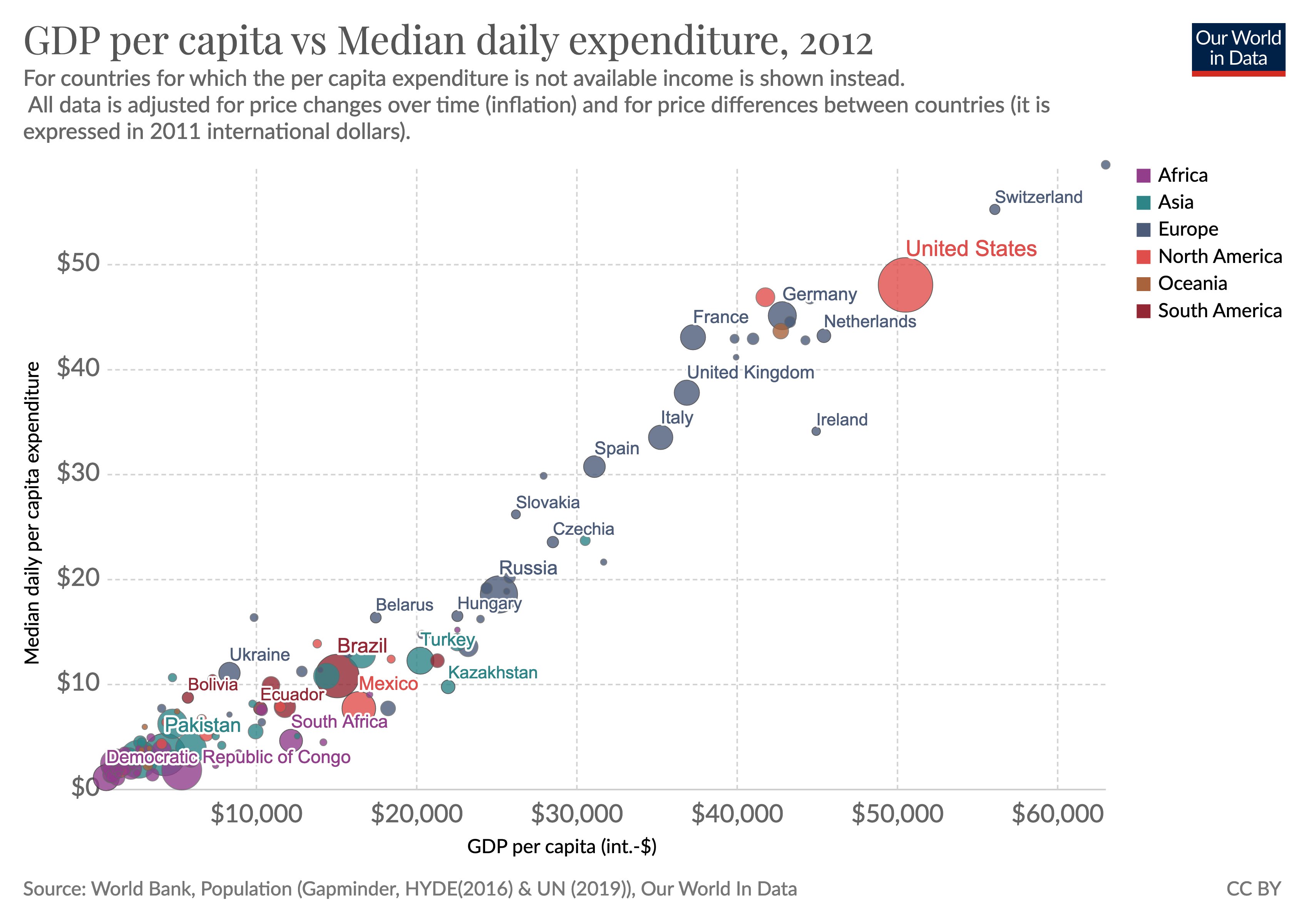
There are a couple of obvious takeaways from this data, most notably that nations in the top-right portion of the chart have much higher levels of economic liberty that countries in the bottom-left portion.
We also see that the United States does very well compared to most other developed nations, though we shouldn’t be surprised to see that Switzerland does even better.
And I assume the dot in the top-right corner is hyper-free market Singapore.
The moral of the story is that there’s a tried-and-true recipe for growth and prosperity based on free markets and limited government.
 For those who doubt that assertion, please identify a country – from anywhere in the world and from any period of history – that became rich with statist policies?
I won’t be holding my breath waiting for an answer.
P.S. One important thing to understand is that the vertical axis in the above chart is based on “median” daily expenditure, which means the spending of the hypothetical person in each nation who is better off than 50 percent of the population and worse off than 50 percent of the population.
The “mean” average, by contrast, is calculated by dividing total expenditure by population.
Both median and mean are legitimate ways of figuring out an average, but median is often viewed as a better way of showing the person in the middle while mean is viewed as a better way of capturing aggregate conditions.
For what it’s worth, the U.S. bubble in the above chart presumably would be even higher if the vertical axis was based on mean rather than median daily expenditure. That’s because of a large number of very successful people with very high expenditure levels in America.
P.P.S. By the way, I should point out that Our World in Data is not a libertarian site or conservative site. Indeed, I suspect the academics who run it lean to the left.
Just consider this bit of editorializing in the site’s discussion about economic growth: “While in the US, for example, most of the income gains went to the richest members of society this is not true of other countries where economic growth was widely shared among all.”
 It’s certainly true the rich have enjoyed large income gains in the United States, so there’s nothing technically inaccurate about that gratuitous bit of class warfare.
But people who work closely with economic data surely understand that you don’t just want to focus on how the pie is sliced. You also want to know the size of the pie.
When you look at both types of data, you learn that ordinary Americans are much better off than ordinary people in other nations – which is the opposite of what is implied by the quote.
No comments:
Post a Comment